25+ Tasty Food Truck Website Examples to Inspire You and Attract More Hungry Customers
As someone who has been running a website in the food truck industry for over eight years, I can tell you that having a website is not just a nice-to-have, it’s a must!
Whether you’re an aspiring food truck owner or an established operator, an effective website can serve as a powerful tool to attract customers, showcase your menu, and manage orders.
Let’s dive into some top-performing food truck websites and see what makes them stand out.
25+ examples of food truck websites to inspire You
1. GOOD MOOD Truck: A Picture of Health and Happiness
This site radiates positivity with its bright, cheerful design.

Their eye-catching slogan and clear call-to-action instantly engage visitors. The site cleverly integrates its Instagram feed, providing fresh content and real-time updates. Plus, a pre-ordering option shows they understand their customers’ need for convenience.
2. Food Truck Catering Company: Professionalism and Flexibility
Here we have an example of elegance in simplicity.

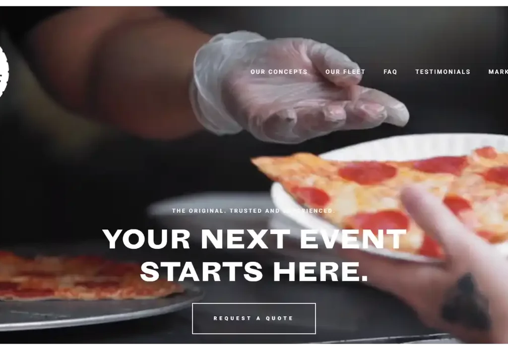
The site boasts a full-width hero video that instantly draws the eye, while a testimonial slider adds credibility. The clear value proposition and request-a-quote form are strategically placed to convert site visitors into potential customers.
3. Old World Pizza Truck: Authenticity and Simplicity
The food truck website design captures rustic charm. It reflects the traditional wood-fired pizzas.

The simple handwritten logo and pizza illustration go well with the overall aesthetic. The detailed menu has prices and photos. There is also a contact form and a catering page to provide all the necessary information for customers.
4. Cousins Maine Lobster: Modern Design Meets Classic Flavors
This food truck design website is a great example of a sleek, modern design that still maintains a connection to tradition.

The brand’s identity is reinforced by the blue and white color scheme and lobster icon. As you glide the cursor across the page, the image shifts to spotlight the pointer’s location. Customers can easily get their lobster fix with the online ordering system and location finder.
5. The Halal Guys: Bold and Dynamic
With a geometric pattern and video banner, the Halal Guys’ website immediately catches your attention. Features like an online ordering system and a loyalty program not only enhance the user experience but also encourage repeat visits.

6. Waffle Bus: Fun and Creativity
This website’s fun design perfectly reflects the innovative waffle sandwiches on offer.

The waffle pattern background, cartoon logo, and waffle truck animation add to the site’s playful vibe, while a detailed menu and social media feed keep customers informed and engaged.
7. Coolhaus: Quirky and Cool
The Coolhaus website beautifully showcases the brand’s personality with its pastel color scheme, retro font, and collage style. An online shop not only allows for easy ordering but also presents an opportunity for additional revenue.

8. Salt N Pepper Food Truck: Clean and Minimalist
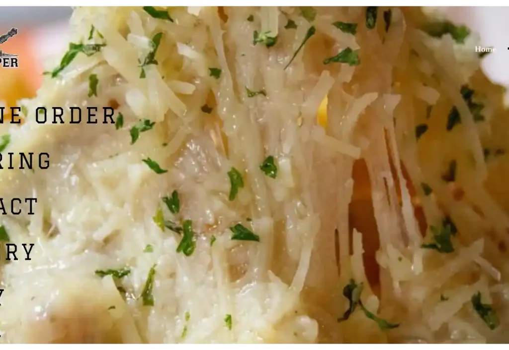
This food truck website template is a great example of a clean, minimalist design that effectively communicates the brand’s message. A menu with prices and photos, a catering page, and a contact form make it easy for customers to interact with the business.

9. 5 Elementos: Engaging with Colors and Icons
5 Elementos takes a different approach with a vibrant, rainbow-colored website.

Their use of icons to illustrate their menu items not only adds visual interest but also helps visitors quickly identify what they offer. With an integrated location map, the site makes it easy for customers to find this Miami-based food truck.
10. Miffies Coffee: Capturing Coziness
Miffies Coffee’s website creates a warm, inviting atmosphere with its brown and beige color scheme.
The site does an excellent job of showcasing its offerings with well-photographed menu items. Plus, the blog section serves as an excellent platform for engaging content, making it a go-to resource for coffee enthusiasts around Denver.

11. The Tropic Truck: Exuding Exoticness
The Tropic Truck’s website design mirrors its Caribbean-inspired menu.

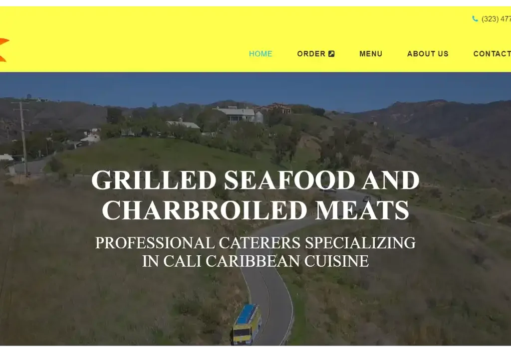
The blue and yellow color scheme, coupled with floral patterns, gives off a tropical vibe. The site also leverages social media feeds for real-time updates, helping customers stay connected.
13. Zs Buddies Sushi and Ramen: Fresh and Appetizing
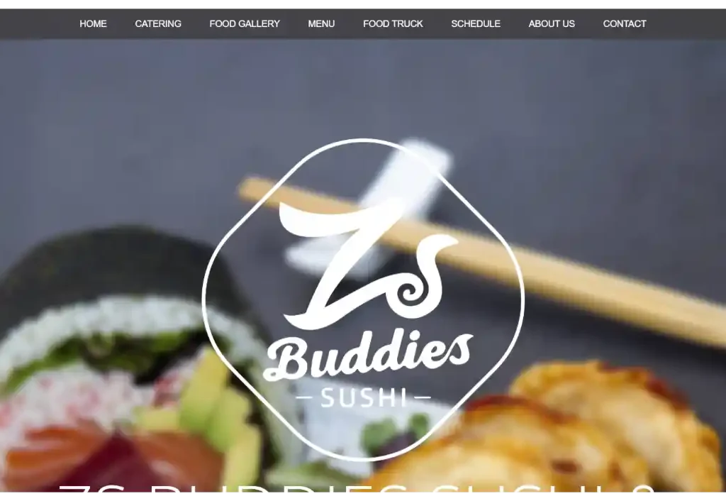
Zs Buddies Sushi and Ramen website translates the freshness of its offerings into its design.

The blue and pink color scheme and watercolor effects create a visually enticing platform for customers in Seattle. The well-organized menu and catering page further enhance user experience and make it a top choice for sushi lovers.
14. The Go Go Truck: Cute and Charming
The Go-Go Truck’s website is a testament to the power of charming design.

The yellow and grey color scheme, truck logo, and polka dot patterns give it a unique identity. The site also features a well-detailed menu and a location map, making it easier for dessert lovers in Austin to find them.
15. Big Green Truck Pizza: Rustic and Authentic
Big Green Truck Pizza’s website mirrors its rustic pizza offerings. The green and brown color scheme, truck photo, and wood texture background create an authentic experience. The detailed menu and gallery page add depth to the site, making it a favorite among pizza lovers in New Haven.
16. Dire Lion: Lively and Energetic
The Dire Lion website exudes energy with its purple and orange color scheme.

The lion logo and gradient effect give it a unique identity. The well-detailed menu, catering page, and social media feed make the site an engaging platform for health-conscious foodies in Orlando.
17. The Steak Truck: Classic and Elegant
The Steak Truck’s website commands attention with its classic and elegant design. The red and black color scheme and steak logo reflect its premium offerings. The comprehensive menu and catering page make it a go-to resource for steak lovers in New York.
18. Food Smackdown: The Trendsetter
Food Smackdown is a trendy and appealing food truck website design. It is based in San Diego. The website has a black and white color scheme, a burger logo, and a video background. This makes the site engaging and easy to navigate. Food Smackdown updates their locations on the website and social media. This makes it simple for customers to find them.
19. Puddin DC: Sweet and Delightful Design
Puddin DC is a food truck that makes Southern comfort food. Their website design is delightful. They use pink and brown colors, a pudding logo, and a striped background. It looks inviting and lively. One special thing is their online shop. Customers can order easily there.
20. Chez Felix Gourmet: Chic and Sophisticated
When it comes to sophistication, Chez Felix Gourmet’s food truck website design is a winner.

A French cuisine food truck based in New York, their site uses a blue and gold color scheme, a chef logo, and a parallax effect that adds depth and interest to the site. Their menu, catering page, and contact form are clearly laid out, making it a user-friendly site.
21. Bowl’d Acai: Health on Wheels
Bowl’d Acai is a food truck based in San Francisco. They specialize in acai bowls and smoothies. Their website reflects their healthy and refreshing menu. The website design features a green and purple color scheme, a fruit logo, and a smooth scrolling effect.
22. Mastiff Sausage Company: Hearty and Savory
The hearty and savory design of the Mastiff Sausage Company’s website matches their gourmet and artisanal sausage offerings. Their brown and yellow color scheme, sausage logo, and full-width hero image make their site visually appealing.
23. Roaming Rooster: Crisp and Delicious
Roaming Rooster, a food truck offering a variety of fried chicken sandwiches, has a crisp and delicious design. The use of a red and white color scheme, rooster logo, and slider banner make the site visually appealing. Their menu, catering page, and social media feed are easy to locate and use.
24. Early Eats Food Truck: Warm and Cozy
Early Eats Food Truck, specializing in breakfast and brunch dishes, has a warm and cozy website design. Their orange and brown color scheme, coffee logo, and textured background create a homely and inviting online presence. Their easy-to-use menu, catering page, and contact form make it a breeze for customers to engage with them.
25. Wrap Around Town: Simple and Minimalist
Wrap Around Town, a food truck offering healthy wraps, has a simple and minimalist website design.

The blue and gray color scheme, wrap logo, and solid background make their site easy to navigate and visually pleasing. Their menu, catering page, and contact form are clearly laid out, making it a user-friendly website.
26. Pita for Good: Bright and Cheerful
Pita for Good, a food truck with a social cause, has a bright and cheerful website design. Their yellow and green color scheme, pita logo, and grid layout make the site visually appealing and easy to navigate. A unique feature of their site is the social impact page, where they share their charitable contributions.
The design and functionality of your food truck website template can make a big difference in your food truck business. Remember, your website should be easy to navigate.


![Successful Blogging: 17 Chrome Extensions for Bloggers [ You Must Use!] 42 Successful Blogging: 17 Chrome Extensions for Bloggers [ You Must Use!]](https://bloggingplex.com/wp-content/uploads/2021/12/Chrome-extensions-for-bloggers-768x432.png)
